May 02, 2017
From Incurable to Incredible

The Changing Perceptions of Inglis & Disability
Displayed on a wall in Inglis’ large event space, Founders’ Hall, rests an old photograph of Inglis’ second location (and first permanent home) at 48th & Darby Road in West Philadelphia. Below the large, stately Victorian home, large block lettering shows a name Inglis used for more than a century —“The Philadelphia Home for Incurables.”
To many, the term “incurables” is not only jarring but unsettling and uncomfortable. But it is part of our history and the history of people with disabilities.
It is hard, when looking at historical documents, NOT to come across equally disquieting, demeaning attitudes and descriptors regarding people with disabilities when compared to our modern sensibilities. Yet it is important to remember that what we view as pejorative and derogatory today was thought to be clinical or purely descriptive by our forebearers.
As the perceptions of people with disabilities have changed through the years, so too have the perception of organizations like Inglis.
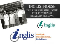
When Inglis became “Inglis House” in 1960, the phrase “The Philadelphia Home for Incurables” became the organization’s tagline — the descriptor.
In 1980, the phrase was finally struck from the signage and promotional materials and legally deleted from the organization in the late 80s. Once done, Inglis could truly re-evaluate its own identity, how it was perceived and wanted to be perceived in the marketplace.
In 1997, Inglis developed a new brand identity. The organization became Inglis Foundation and a design firm developed a new logo in green and black — a lower case “i” that had been modified and had a three-quarter circle around it to resemble a wheelchair user — someone leaning forward — moving ahead. That “wheelchair i” became the Inglis icon.
With the appointment of Gavin Kerr as President & CEO in 2008, Inglis looked at transformational changes — the shift to Person-Centered Care, the investment in new independent living apartments, the expansion of technology for Inglis House and those living in the community, and a new Inglis external identity that reflected
the growth and breadth of services.
In 2013, a branding process was in full swing — incorporating views and voices of the Inglis Community including staff, Board members, residents of Inglis House, those living independently as well as family members and donors.
It was decided that we are Inglis — no matter what — we honor the dream of Annie Inglis and her mother Caroline. We were not going to leave that name behind. However, we dropped “Foundation” and became a corporate entity known as Inglis.
The “wheelchair i” was modified, the letters of our name were tightened. Our name became our logo and the colors were changed to be simultaneously classic and current (blue, orange and grey).
Finally, we developed a new tagline —Ability & Independence. Redefined. The message is clear: Every day brings new challenges and new successes. Each day we choose to redefine what we can achieve — whether we’re referring to a resident, consumer, housing resident, caregiver, staff person, Board member, family or friend. The emphasis is on the individual —YOU get to define yourself - and Inglis helps by providing a strong, stable support system.
The tagline also communicates a secondary message — that Inglis remains steadfast in our mission while ever-evolving and redefining the paradigms of care and support.
From power wheelchairs to smart home technology; from medical procedures to new medications; from independent living to integrated tele-health and wellness care — the landscape for people with disabilities improves daily.
Make no mistake, many barriers still exist — but the progress of the last 140 years clearly shows that people with disabilities will continue to redefine for themselves, their own abilities and independence, every day.
